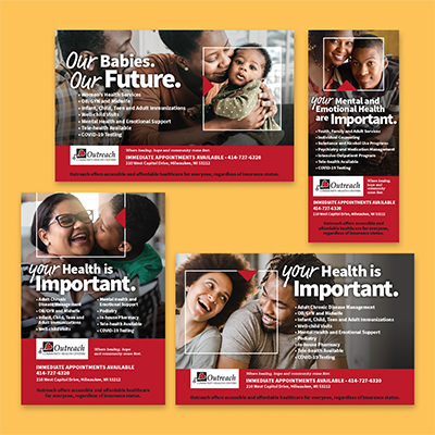
Outreach Important Ad Series

Outreach Community Health Centers approached me to rework their print collateral with a fresh, coherent look to build their community presence. Compiled a Brand Standards Guide alongside developing ad work.
Presented two unique design approaches to this first ad campaign based on supplied headline and existing logo. The chosen concept has the pronoun (your/our) in a handwritten font to emphasize Outreach’s concern for each unique individual identified within the white frame and red arrow. Selected stock images illustrate the importance any one person makes in others’ lives.
Final ads were sized for multiple publications allowing the healthcare organization flexibility to place a differently focused ad into a selected publication whenever needed.
InDesign, Photoshop
return to portfolio page
